Rebuilding Webflow's Navbar & Mega Menu
Master Webflow by rebuilding its iconic, complex navbar and mega menu from scratch. This comprehensive course takes you step-by-step through advanced flexbox layouts, fluid responsiveness, and accessibility best practices. Elevate your Webflow skills and learn to build robust, scalable, and professional navigation systems today.
Difficulty Level: Intermediate Justification: The course goes well beyond basic drag-and-drop mechanics by guiding users through complex, professional-grade technical concepts like fluid typography using CSS clamp() functions, dynamic viewport heights (DVH), semantic ARIA accessibility labels, and custom CSS injections for scroll locking.
What you will learn
- Build a robust, fully responsive navbar and multi-column mega menu from scratch using Webflow's native tools.
- Implement fluid typography and spacing systems using the CSS clamp() function for seamless scaling across desktop breakpoints.
- Master advanced responsive layout techniques, utilizing Dynamic Viewport Height (DVH) to fix common mobile browser UI bugs.
- Design accessible navigation structures using semantic HTML lists, ARIA labels, and proper inheritance practices.
- Create polished user experiences with smooth hover interactions and implement a custom CSS snippet to lock background scrolling on mobile.
Who it's for & prerequisites
- Who is this for: Intermediate Webflow developers, freelance web designers, and agency teams looking to level up their development skills, master responsive layouts, and build professional-grade, scalable navigation systems.
- Prerequisites: Basic understanding of CSS classes and layouts (like Flexbox), familiarity with the Webflow Designer interface, and a free Webflow account
Lessons in this course
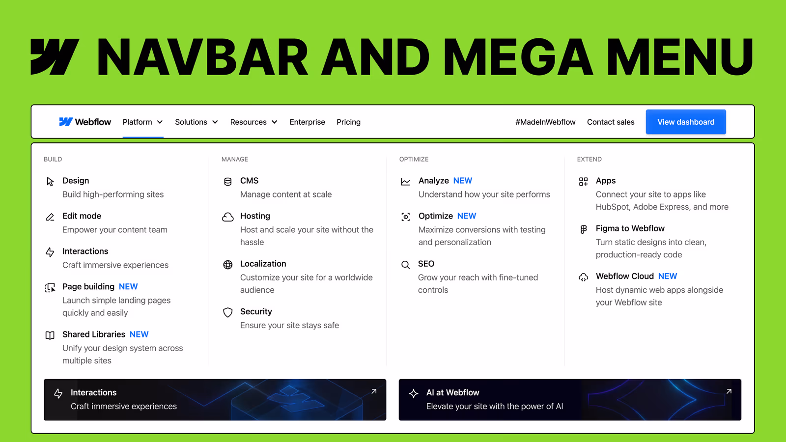
Have you ever stared at a beautifully complex website navigation—like Webflow’s own homepage—and wondered, “How on earth did they build that?”. Many Webflow developers struggle to move beyond basic, clunky dropdowns, getting tangled in messy mobile breakpoints, inaccessible HTML structures, and rigid pixel-based spacing. “Rebuilding Webflow’s Navbar & Mega Menu” solves this exact problem by demystifying one of the most advanced navigation systems on the web.
In this step-by-step journey, you’ll start with a completely blank canvas and build a rock-solid desktop foundation using semantic HTML lists and Flexbox. From there, you’ll dive deep into advanced Webflow layout techniques, utilizing the CSS clamp() function for fluid typography and spacing, and mastering modern viewport units like DVH to guarantee pixel-perfect mobile layouts that don’t get cut off by browser interfaces. You’ll then tackle the structure and styling of rich, multi-column mega menus complete with banners, custom hover effects, and call-to-action buttons.
By the end of this course, you’ll undergo a total transformation in how you approach Webflow development. You won’t just walk away with a pixel-perfect, fully responsive clone of Webflow’s navigation. You will acquire the high-level logic, layout strategies, and structural accessibility best practices (like ARIA labels) needed to confidently build scalable, world-class navigation components for any client project.
Frequently asked questions
Is coding experience required to follow this tutorial series?
No prior coding experience is required, as this is primarily a "no-code" curriculum. You will build the structure using Webflow's visual interface, though the instructor does provide a tiny, copy-and-paste CSS snippet to easily lock the page scroll when the mobile menu is open.
What specific real-world outcomes can I expect after finishing?
By the end of this series, you will have built a professional, fully responsive, and accessible "Mega Menu" identical to the one on Webflow's official homepage. More importantly, you will master highly transferable skills like flexbox layout structuring, fluid responsive typography, and custom hover animations.
How does this path differ from basic Webflow tutorials?
Unlike basic guides, this series emphasizes building a rock-solid, professional foundation with a strict focus on web accessibility, semantic HTML, and ARIA labels. It also teaches you to solve real-world edge cases, such as using dynamic viewport height (DVH) units to prevent mobile browser toolbars from cutting off your menus.
What is the difficulty level and time commitment like?
While the course tackles intermediate-to-advanced design practices, the step-by-step nature makes it highly accessible for ambitious beginners. The instructor starts from a completely blank canvas and methodically guides you through desktop structure, mobile responsiveness, and interaction debugging, removing the intimidation factor.